Elementor Pro
Elementor Pro Performance Overview
Average Mobile Performance
Metrics
Elementor Pro demonstrates low mobile performance with an average score of 72.25. Key metrics such as FCP and LCP indicate long loading times, impacting the initial display of content. The Total Blocking Time (TBT) at 207 ms is higher than other page builders, suggesting potential delays in user interactivity during page loading. The Speed Index (SI) of 5698 ms indicates a longer time for visual rendering compared to the other page builders. Elementor Pro is slow.
For a comparison between Elementor and other page builders, you can check our WordPress Page Builders Speed Comparison page.
For detailed insights into our testing approach, refer to our WordPress page builder speed test methodology.
User Experience
Our Overall User experience
(3/5)
Ease of Customization
Elementor’s settings are somewhat scattered across different locations, which can make management difficult for certain users.
Before proceeding with any design work, it was necessary to first navigate to the admin settings. Here, we disabled Google Fonts, default colors, and default fonts to ensure that these elements inherit from the theme. Additionally, in the page editor site settings, we set the default max-content size to 1290px, matching the theme’s max content width. Furthermore, we adjusted the containers padding to 0px and set widgets gap to 0px. This process, while important, may not be easily accessible for all users, especially considering that these settings are dispersed across different sections, contributing to a lack of user-friendliness.
Overall, our experience with Elementor was somewhat challenging. Simple things often became complex, primarily due to limited options in widget settings.
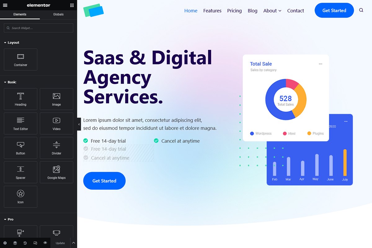
On the positive side, the Elementor editor is well-organized, with widget options thoughtfully categorized into three tabs: Content or Layout, Style, and Advanced. A notable strength lies in the ability to preview the page within the editor as it will appear on the website. In the Pro version, Elementor offers an extensive array of widgets, that should address the diverse requirements of typical website development.
Bugs And Limitations
- Setting Reset Issues: Sometimes, it is not possible to reset a setting. For example, the “align center” option required a click to activate, but a second click doesn’t deactivate the option, and there seemed to be no straightforward way to return to the default value.
- Copy-Pasting Widgets: We couldn’t find a way to copy multiple widgets simultaneously. Copying had to be processed one by one, which is a bit cumbersome and not very user-friendly.
- Page Lagging: As the page size increased, Elementor experienced lag during scrolling or when changing widget settings. This impact the overall user experience, with longer loading times in the editor. At the end, when opening the final page, Elementor needed long time to load and display all the widgets.
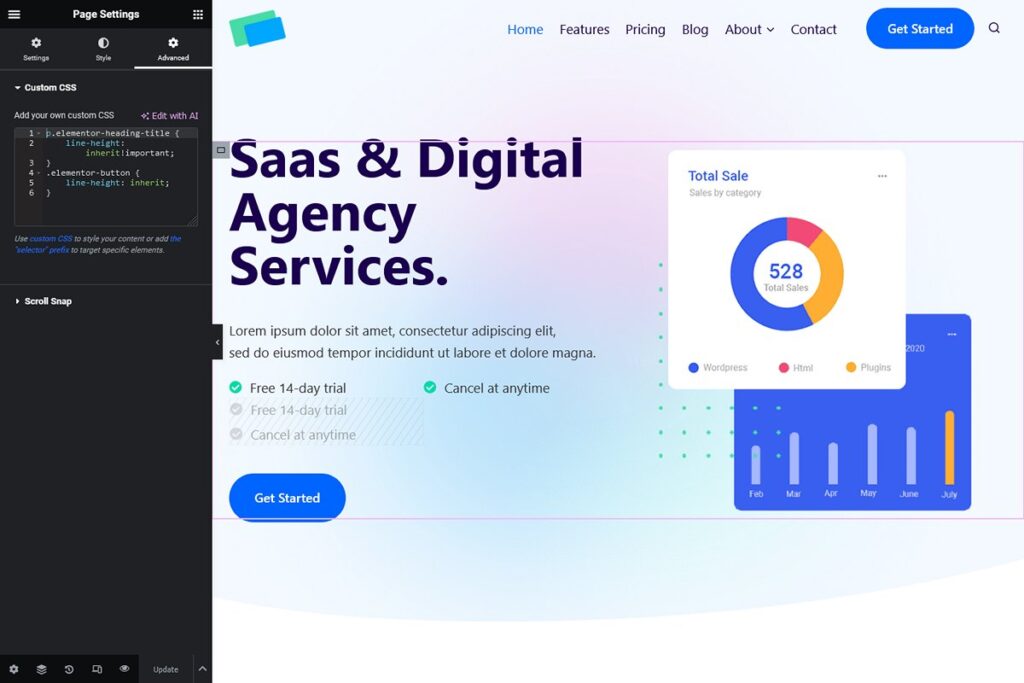
- Paragraph Line Height: Initially, we attempted to use the Title widget to format paragraphs. However, by default Elementor set its line height to 1 instead of inheriting from the theme settings. We tried then the Text widget, to encounter unchangeable default margins. As this widget was also generating excessive inline CSS, we reverted to the Title widget coupled with custom CSS adjustments (in the page settings), a convoluted process for something as basic as inheriting paragraph line height from the theme.
- Buttons Line Height: Similar problem for buttons necessitating the same workaround.
- Icon List: Despite being a simple feature, configuring the number of columns in the Icon List widget posed complications. This necessitated the creation of a container containing 2 Icon List widgets. Unfortunately, this led to alignment issues on tablets and mobile devices, requiring the implementation of an additional container exclusively for these devices. The resulting structure, though effective, was finally complex for an initial very basic requirement.
- Video Popup: To address limitations in the video popup options, additional CSS was required to adjust the play icon design and resize and center the video image.
- Testimonial Widget: Because of insufficient options within the Testimonial widget we had to reconstruct the block using containers. Furthermore, CSS adjustments were necessary to manage margins within a container’s child element.
- Post Loop Widget: This widget lacked essential design options, such as read more mouse hover color, category inclusion in the content box, and box shadow settings. Custom CSS was written to fix the issues with the read more link and box shadow. However, addressing the category-related limitation would have required additional PHP coding. As a workaround, we used the available “Badge” option, displaying a singular non-clickable category in the featured image (this feature can’t display multiple categories).
In summary, Elementor needs more intricate and labor-intensive efforts compared to other builders. Widgets, at times, are too simple and necessitates the recreation of sections using containers or custom CSS. While Elementor boasts power in certain aspects and maintains well-organized options, its user-friendliness falls short of alternatives like Kadence Blocks Pro or Stackable.
The primary advantage of Elementor over other builders lies in its extensive collection of visually stunning templates available across the internet.
Do we recommend Elementor Page Builder?

**Elementor Pro: Caution Advised!**
Elementor provides a mixed experience. While the editor is well-organized and offers a vast template library available on the net, it suffers from performance issues, complexity, and limitations that may result in extra work and challenges, impacting user-friendliness.
Why We Advise Caution:
- Performance: Elementor is slow, affecting the overall user experience.
- Complexity: Managing Elementor can be complex for some users.
- Lack of Widget Settings: Certain widgets lack options, requiring additional customization efforts.
- User experience: Elementor doesn’t offer the best user experience.
Who Should Consider Elementor:
- Template Seekers: If you prioritize access to a wide range of templates, Elementor’s extensive library may appeal to you. Many developers create themes and templates specifically for Elementor.
Who Should Not Consider Elementor:
- Performance Prioritizers: Users who prioritize performance should approach Elementor with caution.
- Simplicity Seekers: If simplicity and ease of use are important, Elementor may not be the ideal choice.

