Divi Theme and Divi Builder
Divi Performance Overview
Average Mobile Performance
Metrics
Divi’s mobile performance ranks quite well with an average score of 91.90. Both the First Contentful Paint (FCP) and Largest Contentful Paint (LCP) are low, contributing to a relatively smooth loading experience. The Total Blocking Time (TBT), while decent, lags slightly behind the top-performing themes and page builders with an average of 174 ms. The Speed Index (SI) of 4977 ms suggests there might be room for improvement in terms of visual rendering speed. Nevertheless, with an acceptable server response time and a favorable DOM size, Divi provides a well-performing experience overall.
For a comparison between Divi and other themes and page builders, you can check our WordPress Themes Speed Comparison and WordPress Page Builders Speed Comparison pages.
For detailed insights into our testing approach, refer to our WordPress theme speed test methodology and WordPress page builder speed test methodology.
User Experience
Our Overall User experience
(2.5/5)
Divi Theme – Ease of Customization
The admin theme option pages are straightforward and user-friendly.
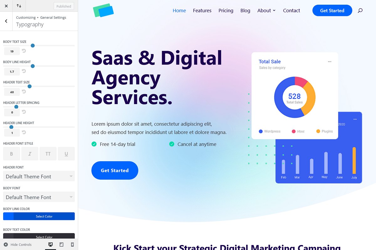
However, the Divi theme customizer falls short in terms of available options, requiring a significant amount of CSS to achieve desired default styling. To address limitations in mobile menu settings, we had to install an additional plugin: Divi Mobile.
Unfortunately, this lack of options in the customizer makes Divi theme less user-friendly.
Divi theme – Bugs And Limitations
- Lack of general global text settings for titles (H1…H6).
- No global color setting for mouse hover on links.
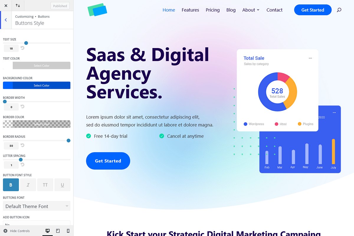
- Buttons lack spacing, shadow, and text settings (only text size was available).
- Scroll to top icon has no settings.
- Desktop header menu lacks font weight and mouse hover color control.
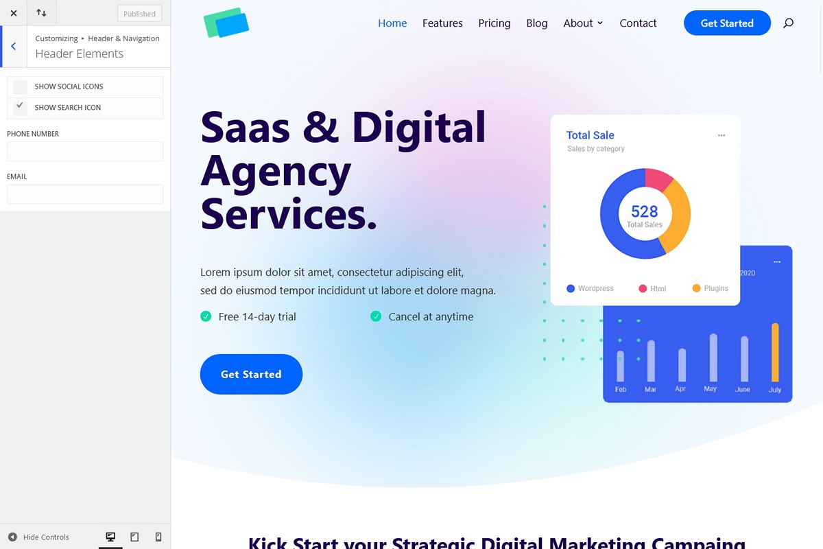
- No customization options for the desktop header search icon.
CSS was required to style the above elements, resulting in a significant amount of code.
In our evaluation against the list of requirements for the test page, we encountered a lot of limitations:
- The absence of a sticky header reveal on scroll up led us to utilize the default Divi “shrink” option.
- There was no option to add a button in the header from the customizer settings. While trying the Divi Header Builder, we discovered that there is no search icon module (only search bar), forcing us to return to the theme customizer header. Here, we implemented a workaround by creating a new menu item at the end of the primary menu and applied custom CSS for the desired styling. Additionally, to ensure the button did not appear on mobile, we had to create a new mobile menu. This experience left us feeling disappointed with the Divi header builder.
- The lack of transparent header settings necessitated CSS to achieve a transparent non-sticky header.
- Sub-menu drop-downs lacked fade-up animation options, we used fade instead.
- Lack of settings in the customizer for menu drop-down, we used this default Divi styling to avoid excessive CSS coding.
- Mobile burger menu hover color was not in the customizer, requiring CSS.
- By default, Divi set 80% width for the header, footer bars, and content rows, this needed to be adjusted with CSS to get the desired layout.
- No option in the customizer to display or hide bullets in footer menus, requiring CSS removal.
- Lack of footer title and text line height settings, necessitating custom CSS.
- Footer bottom bar text styling settings were missing, requiring additional CSS.
- No customization option for the “To Top” icon, needing additional CSS.
- Additionaly it was necessary to reset globally some Divi builder default paddings used in rows and columns.
In conclusion, setting up everything as desired with Divi was not straightforward at all, requiring approximately 110 lines of CSS to achieve the desired styling for content layout, header and menu elements, footer, and the “To Top” icon.
Divi Builder – Ease of Customization
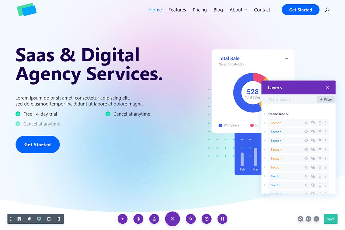
Divi Builder provides a visual editing experience designed for non-developers. Its main goal is to offer an advanced user interface with rich and well-presented functions for seamless visual page editing. The general design and functionalities are impressive, making it easy to use. However, there’s a catch. Some basic properties within the Divi elements (or modules) may not be available, often requiring custom CSS for desired results. This aspect seems to contradict the builder’s primary aim of user-friendliness.
For instance, when working with rows containing multiple columns, you’re confined to predetermined widths. If you desire a custom width, there’s no straightforward option in the builder – you have to resort to writing CSS. Similarly, achieving vertical center alignment for text in a column requires custom CSS. Aligning two buttons on the same line? Yep, you guessed it – CSS comes to the rescue again.
Moreover, when adjusting column widths in rows, it gets a bit tricky. You need to calculate the width by factoring in the columns gutter (the space between columns). For example, if you aim for a 55%-45% 2 columns structure and the gutter is set to “3” (default value), you must first know that “3” equals 5.5%. Subtracting half of this from 55, you would then set the first column width to 52.25% using custom CSS. The complexity intensifies if one day you decide to change the gutter size, as it involves recalculating and revisiting all previously written CSS for all the impacted sections and pages. It’s a bit perplexing, to say the least.
The Divi builder also lacks flexibility when it comes to building complex section structures. We couldn’t find a way to insert sections or rows with multiple columns inside a column, which limits design possibilities. Although Divi offers many predefined layouts, they are fixed and somewhat restrictive, leading to brainstorm alternative methods to figure out how achieve our desired layouts.
This limitation is somewhat surprising considering that Divi is primarily targeted towards non-developers. This is the Divi paradox: while the overall user interface is nice, smooth, and user-friendly, working with it on details is complex and challenging.
Divi Builder – Bugs And Limitations
The Divi builder generally performs well, with only a few encountered bugs:
- Padding issues on certain columns led us to apply them on the parent row for a workaround.
- Custom CSS on a button didn’t work with the “selector” term in Divi Builder but worked on the parent element.
- In a section, the layout seemed fine in the Divi builder editor but appeared broken on the front-end, possibly due to the use of “>” inside Divi custom CSS section.
In our evaluation against the test page requirements, we faced numerous limitations:
- Manual adjustments (via CSS) for column widths in multiple sections, depending on screen size, were necessary. The calculation, involving the Divi gutter, wasn’t straightforward, making it less user-friendly.
- Lack of settings for direct column children in special sections, limiting control over paddings and margins.
- Use of inline CSS to vertically align elements in several rows.
- Absence of the desired section divider shape. We used a similar shape and made inline CSS adjustments. Additionally, no width control for dividers necessitated inline CSS.
- No icon list module. We created the desired layout using other modules, particularly the blurb module, with additional CSS for text padding.
- Lack of opacity control for background images, not fixed for our test (it would require recreate the images).
- No size control (contain, auto, etc.) for background images, resolved through inline CSS.
- The blurb module lacked box-shadow mouse hover control, necessitating inline CSS.
- Absence of a video popup module led us to install the Divi Torque Lite plugin. The module needed some CSS to adjust the size and position of the video overlay image.
- We couldn’t complete the desired layout for the testimonial cards with the Divi Testimonial module. The Torque plugin Testimonial was used with added CSS for mobile formatting.
- No post list module available in Divi. We used the Post List module from the Div Torque Lite plugin, requiring extensive CSS for the desired look. Post category display and a Read More link were unachievable with this module.
- No built-in icon/image carousel in Divi; once again, the Divi Torque Lite plugin came to the rescue!
In summary, Divi has a great-looking interface, but when it comes to the details, it’s not the most straightforward to work with!
Divi falls short in providing ample options within its modules, and there’s a lack of flexibility in structuring different sections. This limitation forces users to rely heavily on CSS, making it potentially difficult to maintain a website.
Divi shines when it comes to ready-made templates, when you want to quickly set up a website and only need to make minor adjustments. However, if you’re aiming to build a complete website from scratch based on a predefined layout, you may have to struggle with the Divi builder.
Do we recommend Divi theme and Builder?

**Divi Theme and Builder: Caution Advised!**
Divi offers a mixed experience of positives and challenges. While the builder has a powerful and user-friendly WYSIWYG (What You See Is What You Get) interface, it comes with limitations in both the theme customizer and the builder itself.
Why We Advise Caution:
- Customizer: Too few options in the customizer leads to heavy reliance on CSS for customization.
- Builder Limitations: Rigid structure of rows/columns. Some modules lack options, necessitating additional CSS.
- Maintenance: Increased reliance on custom CSS can potentially lead to website maintenance challenges.
Who Should Consider Divi:
- Ready-to-Go Templates: If you seek to install a template without extensive customization, Divi can be a suitable choice.
- UI Enthusiasts: Those who appreciate and love the Divi user interface may find using Divi to be a delightful experience.
Who Should Not Consider Divi:
- Performance: Although Divi offers decent speed, if performance is crucial for you, there are better alternatives.
- Building from Scratch: If your project involves developing a website from the ground up, or if you install a template but anticipate a high level of customization, Divi might not be the ideal choice. The customizer and builder limitations might lead to struggles and substantial CSS coding.


