Neve Theme Pro
This post has affiliate links. If you buy something through these links, we may earn a commission. It’s okay – we love our recommended themes and page builders anyway, and you will too!
Neve Theme Performance Overview
Average Mobile Performance
Metrics
Neve shows impressive mobile performance, securing an excellent average score of 95.40. Notably, the FCP (First Contentful Paint) performs well with a recorded time of 1568 ms. The LCP (Largest Contentful Paint) also contributes positively to user experience, achieving a time of 1879 ms. The Total Blocking Time (TBT) is notably low at 86 ms, showcasing minimal delays in responsiveness and ensuring a smooth browsing experience. Neve maintains an overall very good performance.
For a comparison between Neve and other themes, you can check our WordPress Themes Speed Comparison page.
For detailed insights into our testing approach, refer to our WordPress theme speed test methodology.
User Experience
Our Overall User experience
(4.2/5)
Ease of Customization
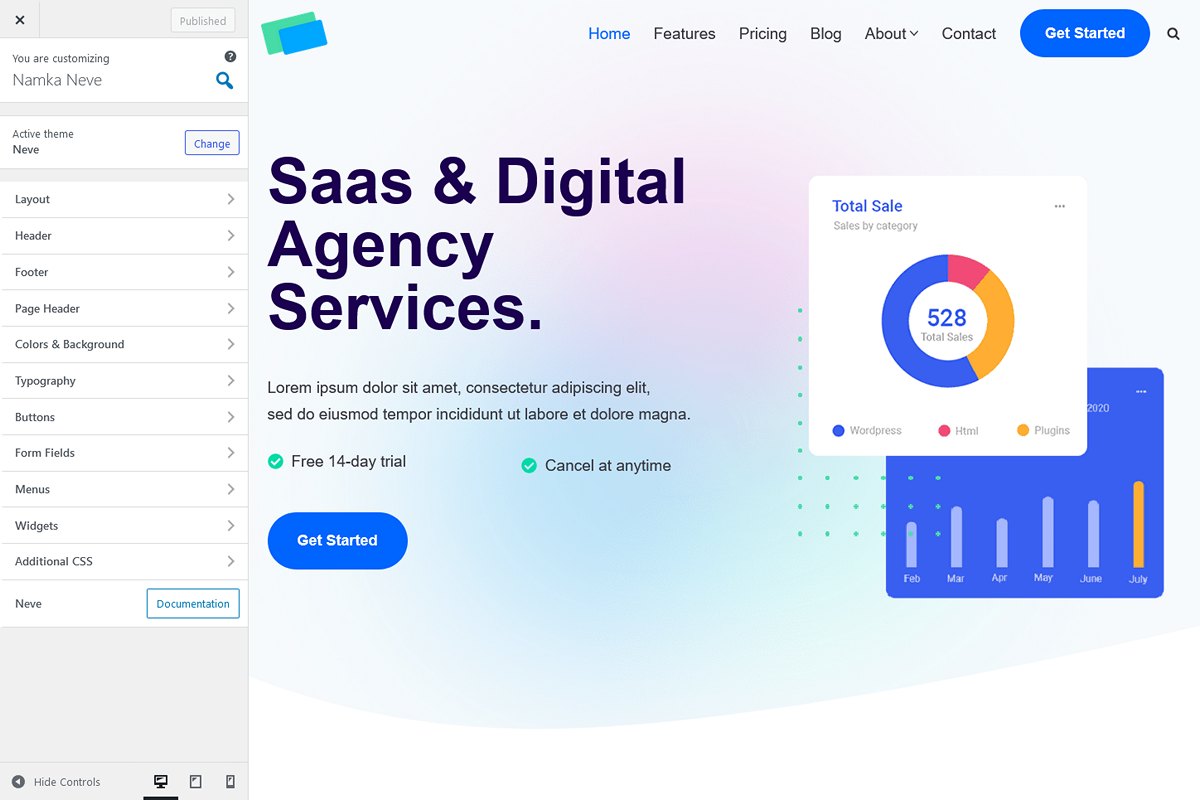
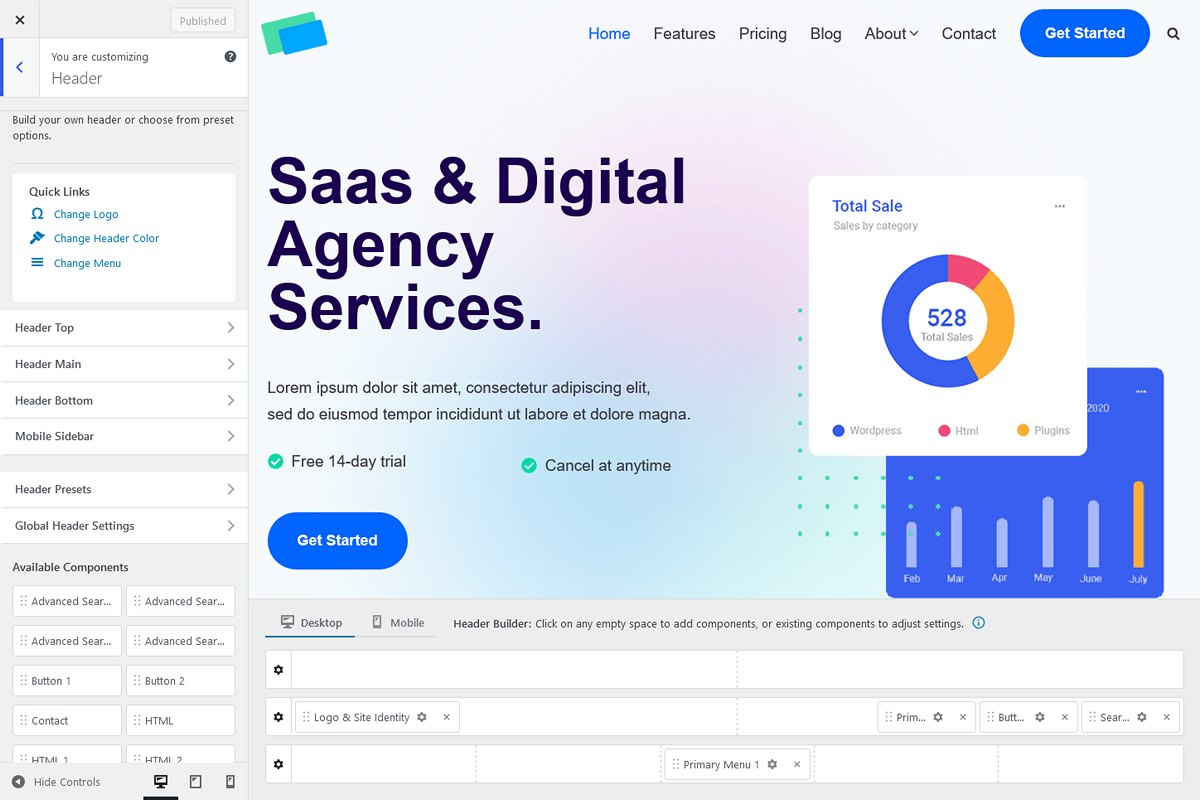
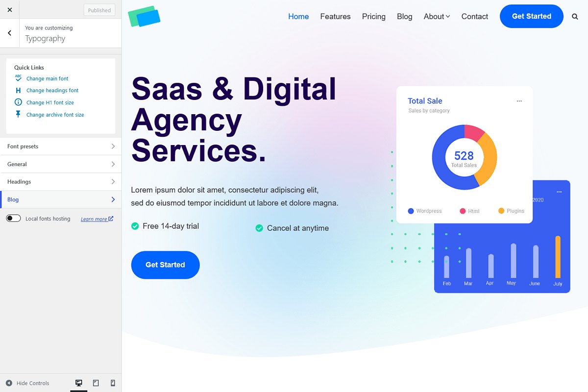
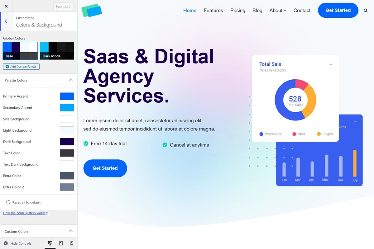
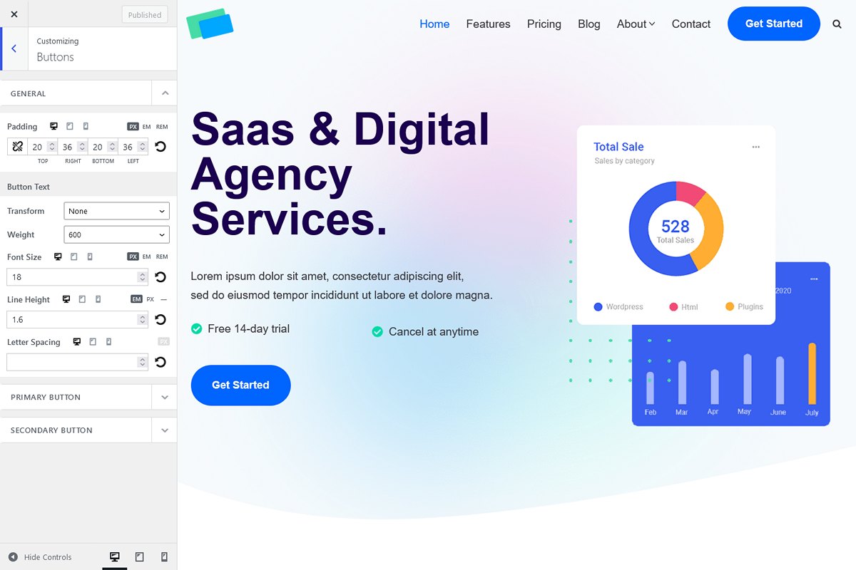
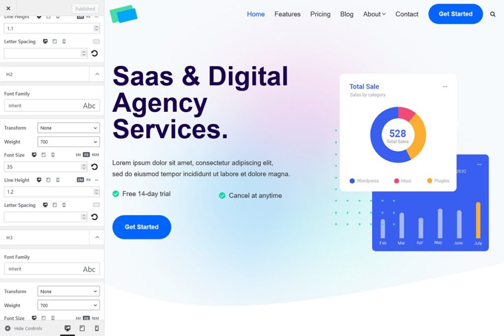
The Neve theme presents a clear and straightforward admin page, contributing to a positive initial impression. The customizer is well-organized and feature-rich, offering an intuitive layout for users to find the necessary settings.
However, one minor inconvenience is the inconsistency in settings inheritance across different devices. While the desktop settings are easily applied, tablet and mobile settings sometimes require redundant declarations in the customizer, adding a layer of complexity.
Another issue is the occasional absence of clear demarcation between sections, making it a bit difficult to differentiate each of them. This occasional lack of clarity can lead to confusion during the customization process.
Bugs And Limitations
- Button Shadow: Despite customizer settings, the shadow is not applied on the front-end.
- Header Main Row Height: Set but not reflected on the front-end. Resolved with CSS.
- Mobile Menu Submenu: Submenu icon size setting has no effect in the customizer and front-end.
- Mobile Menu Items: Hover color setting doesn’t precisely apply on the front-end (opacity set at 0.9 by Neve can’t be changed in the customizer).
- Buttons: Lack of mouse-over shadow, addressed through CSS.
- Color Selector: Inability to adjust transparency when selecting a color from the palette.
- Titles: No global color control for titles, resolved with CSS.
- Desktop Submenu: No width control, added through CSS.
- Mobile Burger: Size and hover color settings not available in the customizer. Adjusted through CSS.
- Mobile Menu Item: No border-bottom control, managed with CSS.
- Mobile Submenu: Lack of animation on open/close.
- No Sticky Header Reveals On Scroll Up: While Neve suggests achieving a shrink feature instead, it involves recreating a full header row identical to the main one. This method seems somewhat excessive for a feature that ideally should only require the creation of 1 header row. To address this, we followed Neve’s recommendation but opted for a simple row with only the navigation menu. This aspect stands out as a drawback for Neve in comparison to its competitors, highlighting the need for a more straightforward process.
- Sticky Header: No shadow control.
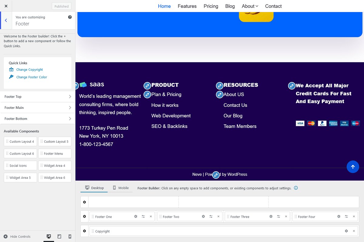
- Footer Rows: No padding control, added via CSS.
Despite these observations, Neve proves to be feature-rich and relatively easy to navigate. While the customizer sections may lack clarity at times, and some features require custom CSS, Neve maintains stability with few bugs. It stands as a decent theme, but certain improvements in usability and clarity could enhance the overall experience.
Do we recommend Neve Theme Pro?

**Neve Theme Pro: Highly Recommended!**
Neve Theme Pro stands out as an exceptional choice with, rich functionality, and user-friendly features. Notably, its remarkable speed sets it apart, making Neve a top contender among high-performance WordPress themes.
Why We Recommend Neve:
- Speed: Neve excels in delivering an exceptional level of speed, ensuring swift loading times for optimal user experiences.
- Feature-Rich: With an extensive set of features, Neve provides a comprehensive solution for website development.
- User-Friendly: The intuitive interface make Neve accessible to users of various skill levels.
Who Should Consider Neve:
- If speed is a top priority, Neve is an outstanding choice. Its feature-rich environment and user-friendly design contribute to a seamless website development experience.
Who Should Not Consider Neve:
- Neve may not be the ideal choice for users seeking an automatic shrunk sticky header, as this implies building an extra header, which may be considered less straightforward compared to alternatives offered by competitors.
