Avada Theme and Avada Builder
Avada Theme And Avada Builder Performance Overview
Average Mobile Performance
Metrics
The PSI result for Avada website builder indicates below-average mobile performance, with an average score of 72.68. Both the FCP (First Contentful Paint) and LCP (Largest Contentful Paint) metrics suggest relatively slow loading times for initial content display. While the Total Blocking Time (TBT) is moderate, the Speed Index (SI) of 6548 ms indicates a longer time for visual rendering compared to normal standards. Overall, Avada is slow.
For a comparison between Avada Website Builder and other themes and page builders, you can check our WordPress Themes Speed Comparison and WordPress Page Builders Speed Comparison pages.
For detailed insights into our testing approach, refer to our WordPress theme speed test methodology and WordPress page builder speed test methodology.
User Experience
Our Overall User experience
(1.5/5)
Avada Theme – Ease of Customization
Upon installation, Avada automatically creates three post types: Portfolio, FAQ, and Elastic Slider. While these might be useful for some users, it is not very user-friendly to have them installed by default without the user’s consent or need. Additionally, Avada not only adds things but also removes others, like widgets. Although there are options to adjust these, it adds a layer of complexity, especially for new users, and makes the interface less user-friendly.
If you are used to other themes or builders, Avada might feel unfamiliar because it uses its own admin page for theme settings, instead of the WordPress customizer, and its own page builder. Whether you are familiar with WordPress or not, there will be a learning curve.
While Avada theme offers a lot of options, we found several limitations that required custom CSS, such as controlling the number of columns in the footer on tablets, or setting the maximum width of the logo. Additionally, Avada theme doesn’t seem to support Gutenberg edited widgets. Although you can still use them, they are placed as code inside a “block” widget, which isn’t very user-friendly.
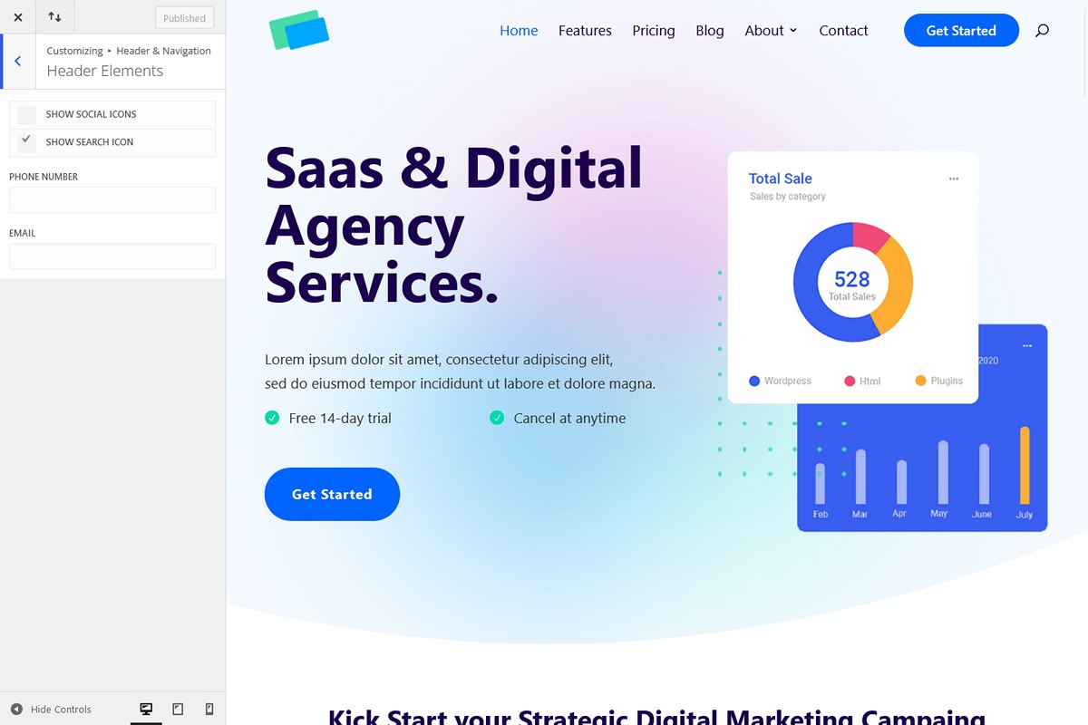
One of the most challenging aspects was setting up the header, especially the sticky feature. While we used the header builder, we were limited by the absence of a search icon element, which required a workaround using other elements. We also encountered issues with background colors when the header was sticky. Overall, using the header builder wasn’t as easy as it should be.
Avada theme – Bugs And Limitations
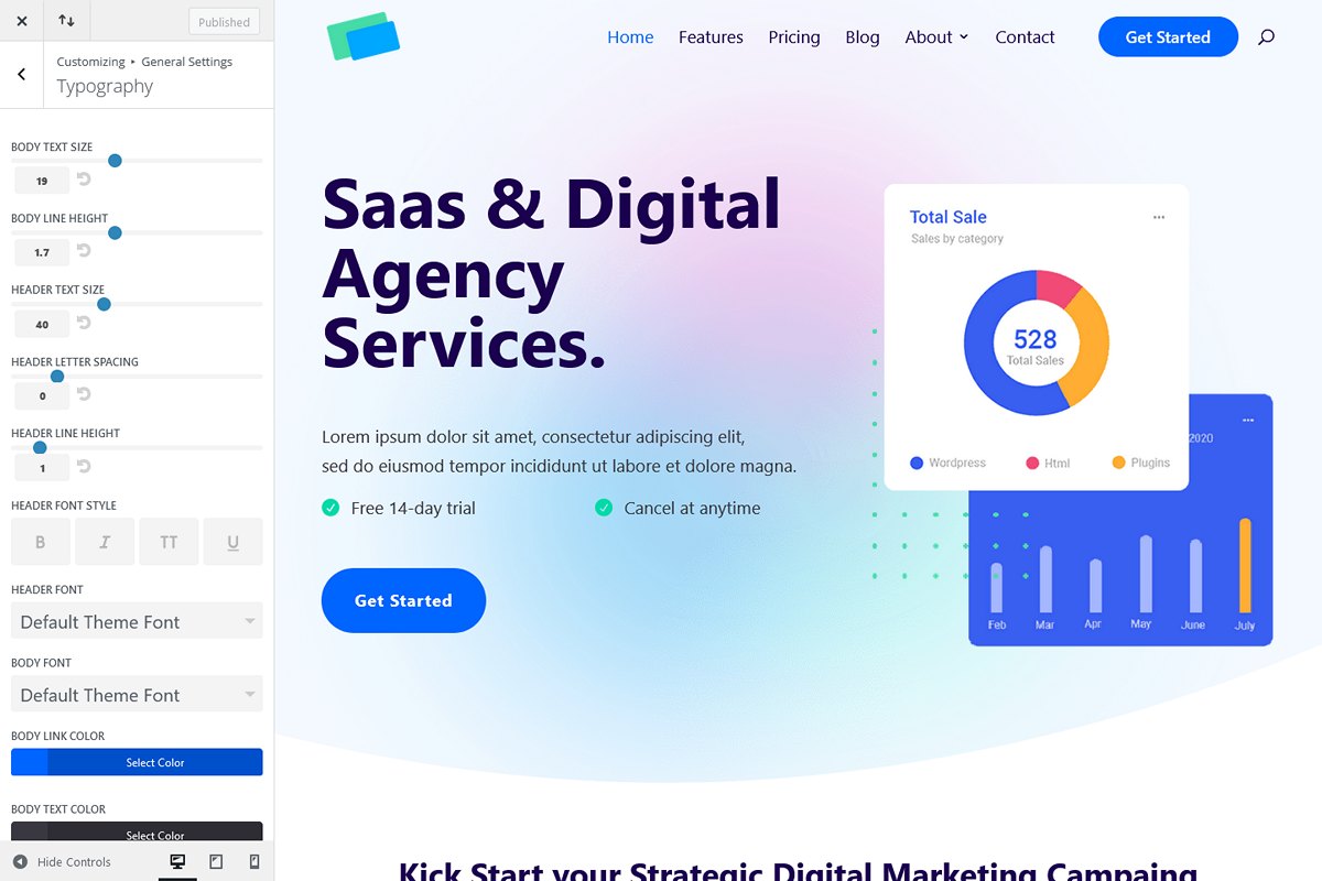
During usage the Avada theme was generally stable, with few bugs encountered in the admin. One issue was with the typography settings where sometimes the color selector icon would overflow outside of its container, making it invisible along with other options on the right side.
Although we encountered only a few bugs with the theme, they were the type that made us feel like we were only seeing the tip of the iceberg!
- The typography color selector icon sometimes became invisible because it overflowed outside of its container.
- There was a strange issue where the color set as “color 1” in both the builder and the admin area differed from the color set in the global color settings. This was resolved by reapplying and saving the settings.
- Lack of support for the Gutenberg editor in widgets.
- There is no option for setting a maximum width for the logo.
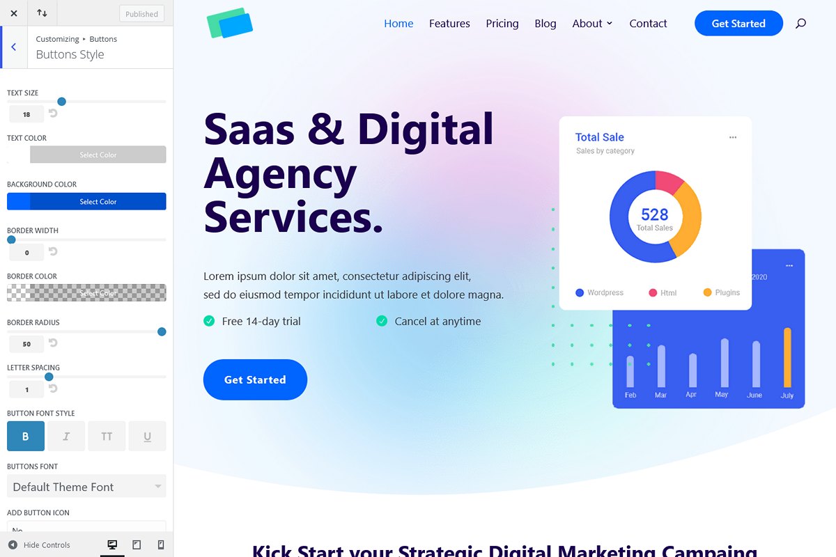
- The theme does not provide control over box-shadow for buttons.
- Surprisingly, there is no font-weight option available in the global settings for typography.
- Customizing the footer columns for tablet devices requires using custom CSS.
- There is no option to control the size of the “to top” button.
In conclusion, while Avada theme offers a rich environment for detailed setup in many aspects, it proved to be challenging to work with, particularly concerning two crucial elements: the header and footer. Setting up the header (using Avada builder) required significant effort and coding. Similarly, managing the footer, which involves in our case Gutenberg edited widgets in form of code inside a “block” element, was not straightforward.
Avada Builder – Ease of Customization
Avada builder provides both a back-end and a front-end editor. The back-end editor feels a bit outdated and rigid. It has several limitations, such as no search icon element, and issues with section separators. The front-end visual editor initially seems better, but it is often buggy, especially with saving changes, making it difficult to use consistently. As a result, we mostly relied on the back-end editor despite its challenges, because at least its user interface is stable.
Avada Builder – Bugs And Limitations
The Avada builder had multiple bugs during usage:
- Content Width: The maximum width for content doesn’t follow the theme’s global settings.
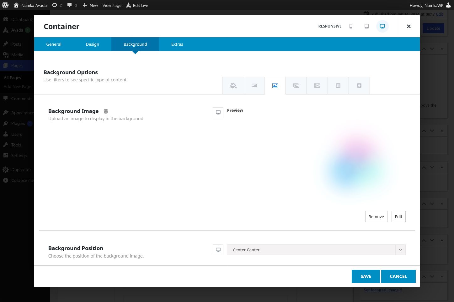
- Section Separator: Some separators, including the one needed for the test page (curved), seem to have their shapes inverted (top shape is actually bottom shape and vice versa). As a simple fix, we used the waves shape instead.
- Section Separator Position: While the separator width is correct (full screen width), it’s not positioned on the extreme left for the bottom separator. The top separator works properly.
- Front-end Editor: There were a few occasions where the front-end editor failed to load.
- Front-end Editor Saving: Sometimes, the front-end editor save button is not clickable after adding an element or adjusting settings.
- Title Element: Font size and margin of the title element don’t automatically inherit from the theme’s global styling.
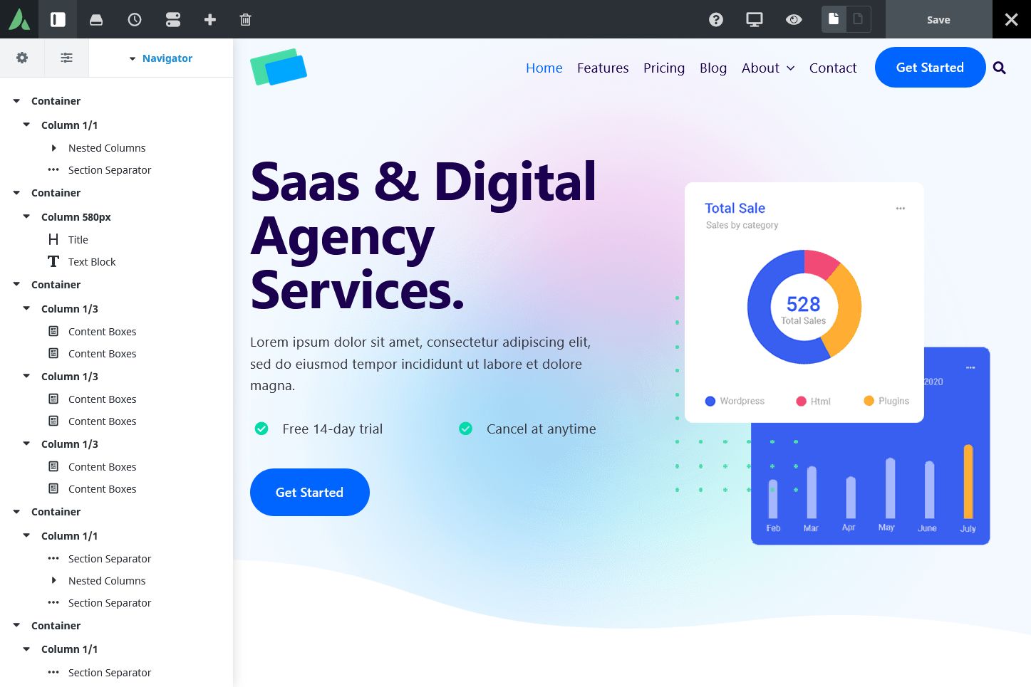
- Title Element HTML: Occasionally, the builder generates incorrect HTML like: <h1 class=”fusion-title-heading title-heading-left” style=”margin:0;font-size:1em;”></h1><h1>Saas & Digital Agency Services.</h1>.
- Title Element Margins: Sometimes margins don’t apply on the front-end, as they are forced to 0 for an unknown reason. We wanted to use padding instead but realized that this option doesn’t exist for titles.
- Title Element Position: Setting it to center on small devices doesn’t work; it stays on the left.
- Several Elements: Some styles don’t inherit from the default body text size and color, so the size and color have to be set again for each of these elements.
- Column Margin: Sometimes set to 0 but still appears with a value on the front-end.
In our evaluation against the test page requirements, we faced numerous limitations:
- Buttons lack shadow options in the global settings.
- There’s no built-in search icon feature, and creating one using button and modal elements isn’t straightforward due to limited design choices for buttons.
- Modals lack position settings.
- Title elements lack padding control.
- Checklists don’t offer control over the number of columns.
- In some cases, settings on smaller devices don’t inherit from larger devices, requiring redundant declarations.
- The box layout of content boxes doesn’t respond well to different screen sizes.
- Columns lack control over hover shadows and row spacing on tablets and mobiles.
- Copying and pasting styles between elements isn’t supported.
- Dropping elements inside nested columns in the back-end editor isn’t possible.
- Some elements lack control over z-index.
- Carousels lack dot navigation.
- Styling the container of nested columns isn’t supported.
Keep in mind that the list of bugs and limitations mentioned above was encountered over a relatively short testing period, involving the construction of only one page. It is likely that building a complete website would reveal even more issues.
In conclusion, Avada ranks among the less stable page builders we have tested. Due to these stability concerns, discussing other aspects becomes somewhat irrelevant.
Do we recommend Avada theme and Builder?

**Avada Theme and Builder: Not Recommended!**
Avada falls short in several key areas, making it difficult to recommend. It suffers from sluggish performance, complexity in usage, and a multitude of bugs and limitations. Given these issues, we believe there are better alternatives available for users seeking a more reliable and efficient WordPress theme and page builder.
Why We Don’t Recommend Avada:
- Performance: Avada’s PSI mobile score ranks among the slowest we have encountered in our testing.
- Bugs and Limitations: Our experience with Avada revealed numerous stability issues, with a significant number of bugs and limitations surfacing in a relatively short period of use.
